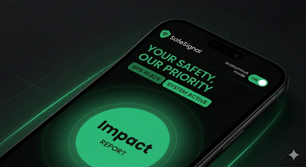
An emergency reporting prototype for people in immediate danger
An emergency reporting prototype for people in immediate danger. Designed for what someone actually needs when they're terrified, not for ideal conditions.
RoleProduct Owner & Designer
Timeline3 Weeks
Research12 Interviews
StageLive Prototype
The Problem
When People Are in Danger, They Don't Report
At university, I was robbed at gunpoint on campus. I sat on the ground for 30 minutes. My phone was in my hand. But I didn't report. I couldn't think clearly enough to navigate an app. That experience showed me the problem isn't theoretical—it's real. People freeze under threat. They can't navigate systems. They don't report.
What Happens When People Don't Report
Unsafe incidents stay undocumented. Perpetrators face no accountability. Communities don't know which areas are dangerous. Patterns go unidentified. Next victims have no warning.
Why People Don't Report
01Fear of retaliation (backed by real cases in testing).
02Shame or blame (self-doubt about what happened).
04Identity exposure (don't want to be traced or identified).
05Distrust of authorities (previous negative experiences).
My Role
Product Owner & Designer
I owned this end-to-end as the product owner during my TSAcademy Product Management training:
Problem research and discovery (lived experience + 12 user interviews)
Product vision and MVP strategy
User research and design decisions
Delivery in 3 weeks
My goal was clear: design for what someone actually needs when they're in immediate danger.
Strategy
The Core Insight
When someone is in danger, they don't have the cognitive capacity to navigate complex systems. They need one action that requires zero decision-making.
Two principles shaped the approach:
Design for the actual moment — When someone is panicked, they can't think
Anonymity is non-negotiable — Fear of retaliation is the biggest blocker to reporting
Strategic Pillars
Speed — Report completed in under 60 seconds with muscle memory alone
Stealth — Invisible to observers; doesn't advertise what it is
Anonymity — No identity collection; reporter can't be traced or retaliated against
MVP Scope
Solving for Panic
Every feature had to serve one purpose: help someone in immediate danger report what's happening. Everything else was cut.
WHAT I BUILT
01Shield icon on home screen (always accessible).
02Double-tap to reveal calculator interface (stealth mode).
032-second press-and-hold on home screen to trigger report.
04Automatic GPS + timestamp capture (no user input required).
02Friend/family notifications (could compromise safety if attacker has phone access).
03Community heat maps (could identify victims).
04Chat or support features (liability; added friction).
05Detailed narrative fields (impossible to fill under stress).
06Geofencing (users report feeling surveilled by location tracking).
Why This Scope
The constraint was ruthless: solve for panic. Nothing else mattered. Every feature that didn't serve that got cut.
Product Decisions
Five Design Decisions
01
Shield Icon + Calculator Cloak
The Idea
The app shows a shield icon on the home screen. Double-tap the shield to reveal a calculator interface. To observers, it looks like a working calculator.
Why It Matters
Someone being monitored or controlled can't open an app that says 'Safety.' But they can open a calculator. Stealth isn't a feature—it's survival.
The Trade-off
✗ Feature discoverability is harder (people don't immediately know what it does)
✓ Users feel safe using it without escalating danger
02
2-Second Hold
The Idea
On the home screen, press and hold the shield for 2 seconds. The report triggers automatically. No menus. No additional steps.
Why It Matters
Under extreme threat, people freeze. Fine motor control fails. Decision-making shuts down. But muscle memory works. A 2-second hold is slow enough not to be accidental, fast enough to be urgent.
The Trade-off
✗ Not intuitive for first-time users (requires explanation)
✓ Works when someone is paralyzed
03
Automatic Evidence Capture
The Idea
When the hold triggers, the system automatically captures: GPS location, timestamp, device type. User can add photos but doesn't need to.
Why It Matters
Someone in panic can't think clearly. Gathering evidence, typing descriptions, making decisions—all impossible. But the system can capture what matters: where, when, what happened.
The Trade-off
✗ Less detailed than a full written report
✓ Removes burden of coherent thinking from someone in crisis
04
Complete Anonymity
The Idea
No phone number. No email. No name. The system doesn't know who reported. Reports are anonymous by design.
Why It Matters
Fear of retaliation is the #1 reason people don't report. If the system can't identify you, retaliation becomes impossible. Anonymity eliminates the fear that keeps people silent.
The Trade-off
✗ Can't follow up with reporter (no contact info)
✓ Removes the barrier that prevents people from reporting at all
05
Dead-Man's Switch
The Idea
After reporting, user gets a 15-minute check-in: 'Are you safe?' If they don't respond, the system escalates the alert as ongoing/urgent.
Why It Matters
An incident might be a snapshot of danger. But if someone doesn't check in after 15 minutes, it could mean they're still in danger or can't respond. Silence should trigger escalation.
The Trade-off
✗ Adds complexity to the user flow
✓ Catches ongoing situations automatically without requiring additional user input
Calculator interface believability: Does it look like a real calculator?
2-second hold accuracy: Triggers on intent, not accidental
Anonymous submission rate: % of reports submitted without identity
Check-in completion: % of users who confirm 'safe' status after 15 minutes
User Voices
From People Who Have Been in Danger
During testing with 8 people who had experienced unsafe incidents:
“
I was robbed last year. I kept replaying it, thinking about what I should have done. For weeks after, I felt like I needed to prove it happened—like nobody would believe me if I couldn't explain it perfectly. If I'd had something that just... captured what was happening in that moment, without me having to remember details or convince someone I was telling the truth... that would have changed everything. And the anonymity part. I didn't want the person who robbed me to find me. I still don't. Something like this—where I don't have to identify myself—that's the only way I'd actually report.
— University Student, 21 | Uniben
“
I've been robbed twice. Both times, I froze. I couldn't call anyone. I couldn't explain what happened. If I'd had this, I could have done it. The anonymity part is everything. I wouldn't report if I thought the person could find me.
— Business Owner, 38 | Abuja
“
The people I work with don't trust reporting systems. They've had bad experiences. But anonymous? That changes things. People might actually use this.
— Community Health Worker, 32 | Port Harcourt
“
I drive at night in areas I don't know. If something happens, I won't remember the street name. But my phone knows where I am. Automatic is better than trying to explain to someone.
— Delivery Driver, 26 | Lagos
Outcomes
Results and Impact
Key Validation
From testing with 8 people who had experienced unsafe incidents:
All 8 completed a report in under 60 seconds (exceeded target)
100% said the stealth interface made them feel safe to use the app
7/8 chose anonymous submission without prompting
All 8 said they would keep the app installed even without active threat
Strong agreement that 2-second hold was appropriate (not too easy, not too hard)
High confidence that automatic GPS capture was valuable (people can't remember locations under stress)
What We Learned
Fear of retaliation isn't paranoia. Three testers had experienced retaliation for reporting in the past. Anonymity wasn't a convenience feature—it was the feature that made reporting possible.
Reflection
Reflections and Next Steps
What I Learned
01Products work when they're designed for reality. When someone is in immediate danger, they can't navigate complex systems. They can't make decisions. They can't think. Design from that moment, not from what seems logically complete.
02Lived experience clarifies product decisions. I didn't need to interview 100 people to understand the problem. I lived it. That clarity shaped every single decision.
03Constraints force ruthlessness. A 3-week timeline meant every feature had to earn its place. Nothing was built 'just in case.'
What's Next
Phase 2: Backend infrastructure for secure, anonymous report storage
Phase 2: Community coordinator dashboard (aggregate data without identifying reporters)
Phase 3: Real deployment with communities and measure: Do people actually use this? Does documentation lead to accountability?
Why This Matters
This project proved something fundamental: design for the user's actual moment, not an idealized version of them.
I could have built a comprehensive safety platform with resources, community forums, and integration with authorities. That's not what someone needs in immediate danger. They need one invisible button.
SafeSignal isn't trying to prevent unsafe situations. It's trying to ensure that when they happen, they're documented. Documentation creates accountability. Accountability changes behavior.